SAE Descritption
SAE
SAE Institute is the world's leading educator in creative media industries. Established in 1976, it now counts 53 campuses in 27 countries. Working under the global brand, the new campus in Milan needed its own fresh and strong identity.
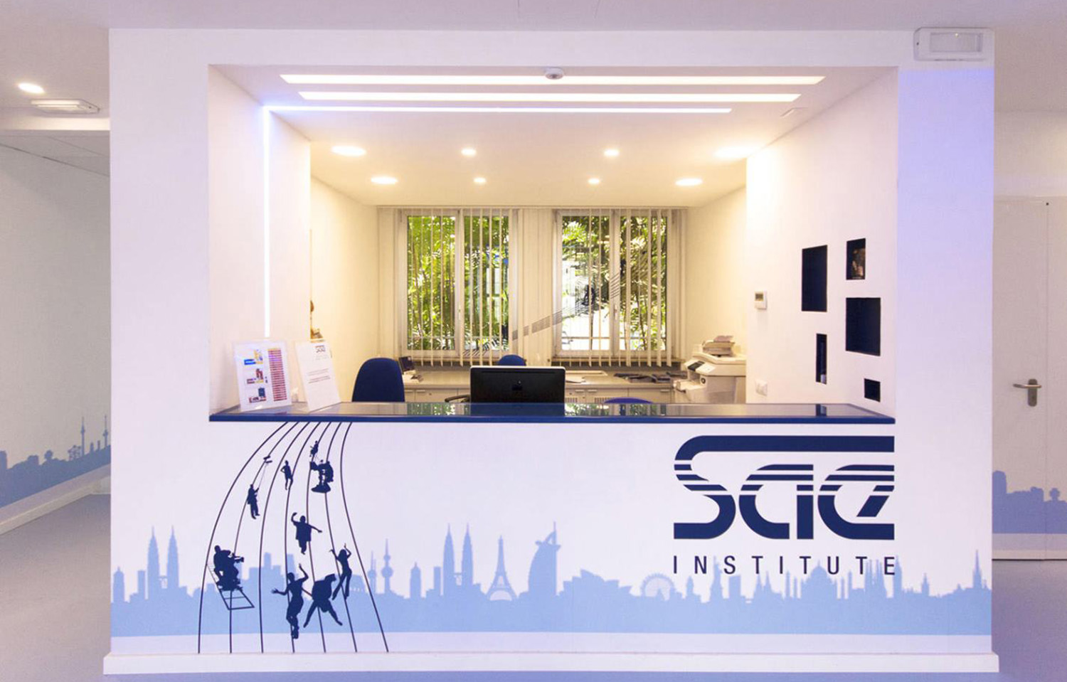
The scope was to create a wayfinding system that could be experienced in a more engaging and fun way by the students and visitors, by “spreading” the brand not only inside the building but also outside, and creating a campus that could become a landmark.
SAE’s visual identity was broken down into its elements and treated architecturally. The logo becomes a visual matrix of the facade, and wraps the building like a second skin, with captivating effects. We worked with multiplication, translating the logo into signage, wayfinding, furniture, and architecture. The graphics invade interior spaces as a pattern becoming both a decoration and a structural element. Icons and lines run through corridors as way-finding elements incorporating signage. It’s an imaginary pentagram that unfolds itself turning also into furniture. It's a seat at the entrance of the school and a light pattern that shows the way and welcome students.
Francesca worked with Ghigos ideas on this project.
<back


